1. Power BI #
1.1 License #
Power BI free is best suited for personal use, where you don’t need to share what you’re doing with others. If you want to share content in Power BI, this requires a Pro or Premium license. Please note that the Power BI Pro license is included in an Office 365 E5 license. Alternatively, this can be purchased separately.
| License type | Functionality when the workspace is in a shared capacity | Additional features when the workspace is in Premium capacity |
| Power BI (free) | Access to content in My Workspace | Consume content shared with them |
| Power BI Pro | Publish content to other workspaces, share dashboards, subscribe to dashboards and reports, share with users who have a Pro license | Distribute content to users who have free licenses |
| Power BI Premium per user | Publish content to other workspaces, share dashboards, subscribe to dashboards and reports, share with users who have a Premium Per User license | Distribute content to users who have free and Pro licenses |
2. Power BI Desktop #
2.1 Retrieve data #
There are lots of data sources you can download, here is an example of pulling an Excel sheet and later a table from a website.
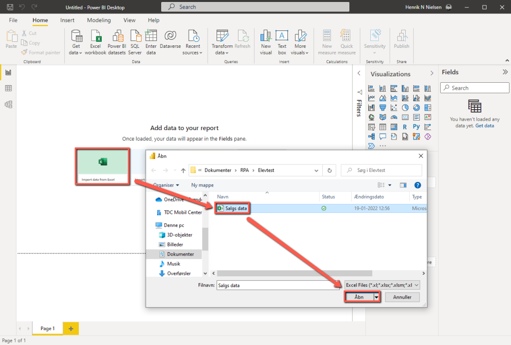
You can click Load here or go directly to Transform Data , which will open the Power Query Editor so you can filter the data you are pulling out before retrieving it. This step can also be done afterwards, as shown further down.
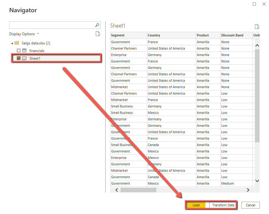
Additionally, you can retrieve more data from other sources and import, as shown here via Web .
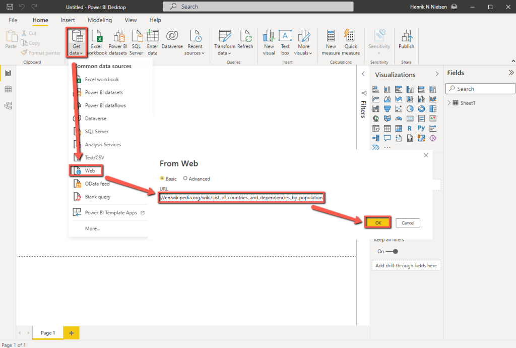
From the Navigator we can see available data from the page, usually tables when it is from home, and then extract this as data. We can again filter the data via Transform Data before extracting it or do this later.
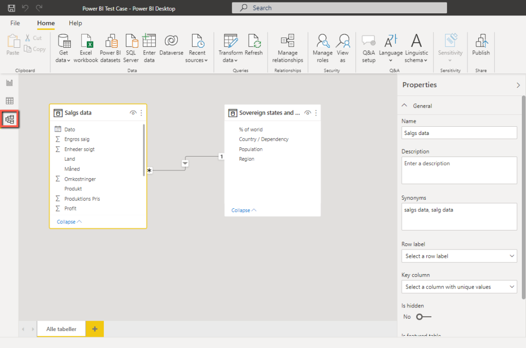
2.2 Overview #
On the far left we can see our report, data and their relationships.

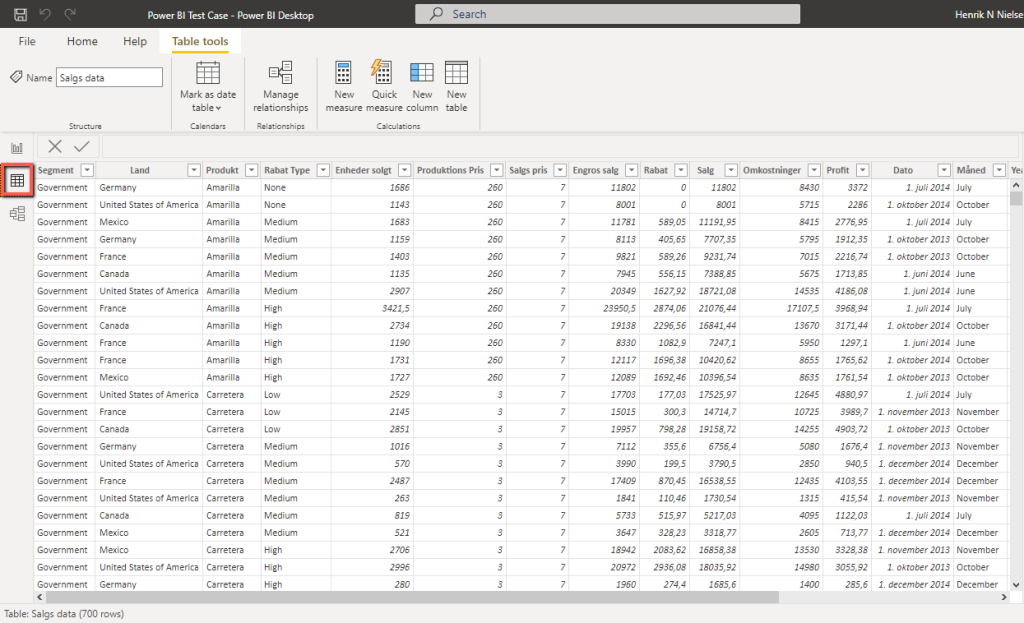

2.3 Create relationships between tables #
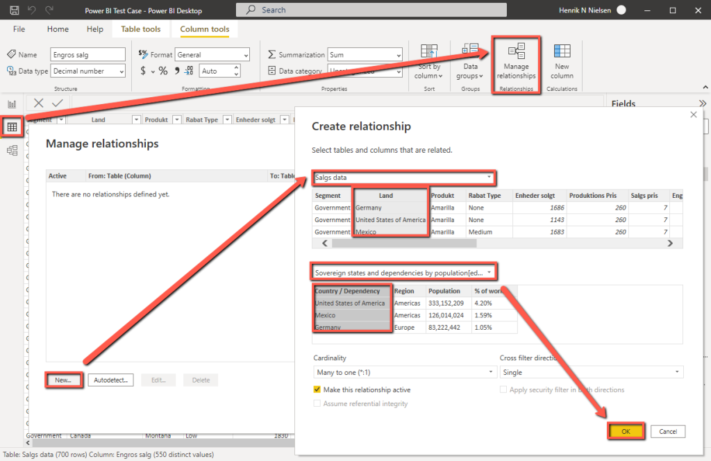
In the model menu, we can see a relationship diagram similar to what you find in databases. From here we can select a field, and drag-drop it onto another table’s field to create a relationship between the two. In this example, we match Country with Country / Dependency , this means that we can later segment on Region when we build our report.

Under Data you can also create these relationships via Manage relationships . From here it is relatively straightforward, and the model is automatically updated afterwards.
2.4 Build a report #
To insert a title, we can create a Text box at the top of the ribbon, and then change the font size and field.

To visualize data, we have a lot of different options, and we can use several in the same report. As shown in the example here, we start with a pie chart that shows total sales, profit, and sorts it by country and region.
Additionally, we can insert a table, please note that the columns will be sorted in a top down order.
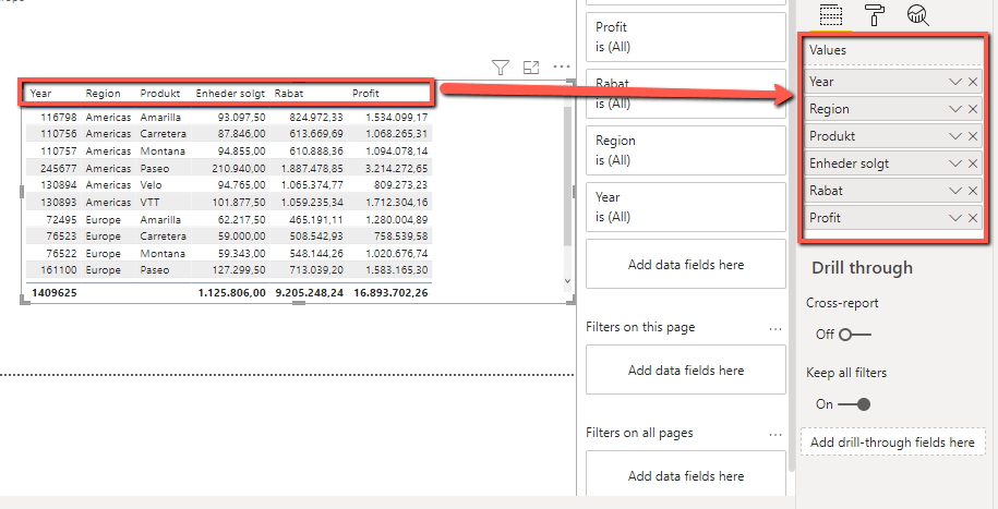
From the previous image, the year looks wrong, that’s because Power BI took the sum of these and added them together. If you click on the down arrow and select Don’t summarize, you get the correct year.

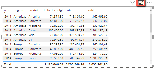
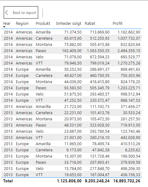
We cannot see the entire table due to its size, but you can enlarge it by clicking on the icon.
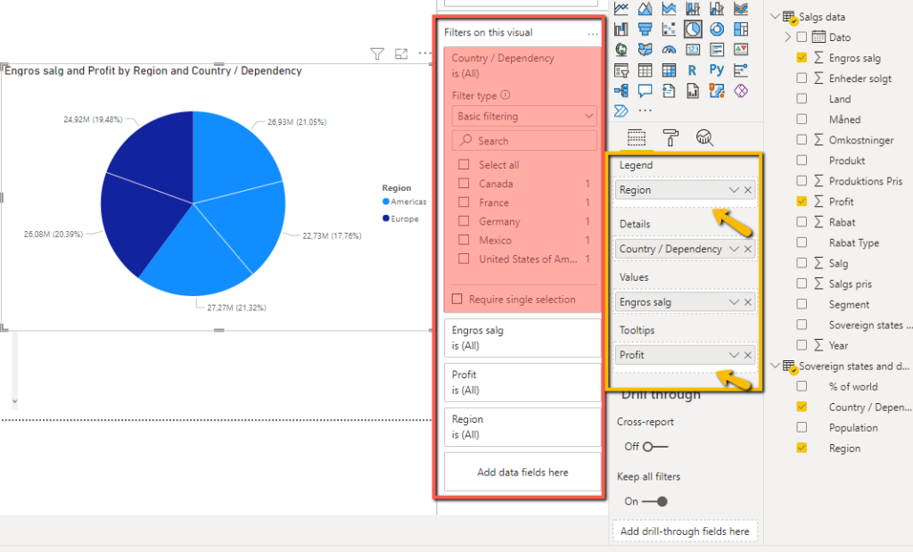
Finally, it can be mentioned that filters can be set on the visual fields you insert, in the image marked with red . Marked in yellow are the options for the individual diagram, regarding how the data should be displayed. Depending on the type of diagram used, the fields are moved either via drag and drop or by pressing the down arrow and inserting them elsewhere. There will be a white border under the field if it is possible to insert more fields under the same type.
2.5 Measure #
Measures are calculations that can be made as fields that we can use for visualization. They are very similar to Excel formulas that you would typically create in your spreadsheets.
These can be created either from the ribbon under Home – New measure or by right-clicking on a table and selecting New measure .

When creating a new Measure we get a blank formula we can write in. Note that the Measure to the left of = can be any name we give to the given measure, and everything to the right of will be the formula itself. In this example we are making a sum of the profit.
You can later open your measure again by selecting it, and then see the formula above the ribbon as shown here .
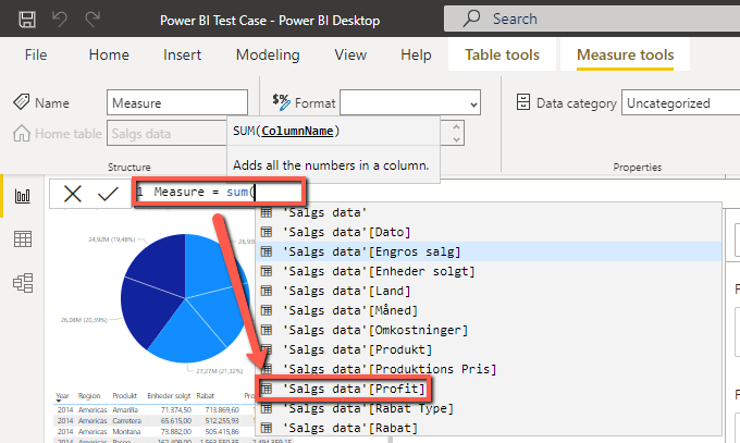
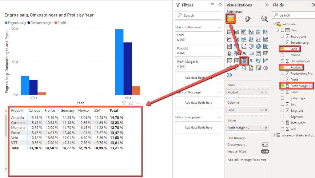
In this example, we calculate the profit as a %, and further refer to the previous measure we made.

To visualize our new profit, we can create a matrix , and segment by Product and Country . This will show which country each product is most profitable in.

We can remove the bottom total value, as it is not useful, by Format visual and then setting Row subtotals to Off .

2.6 Publish #
Under File select Publish – Publish to Power BI .

Select the desired workspace and press Select .

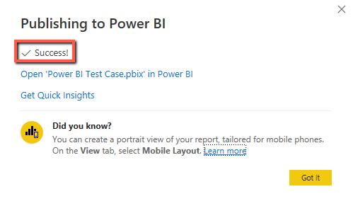
When it says Success!, the report and dataset can be found in O365, in the given workspace .
In the O365 portal you can then view your report and dataset.
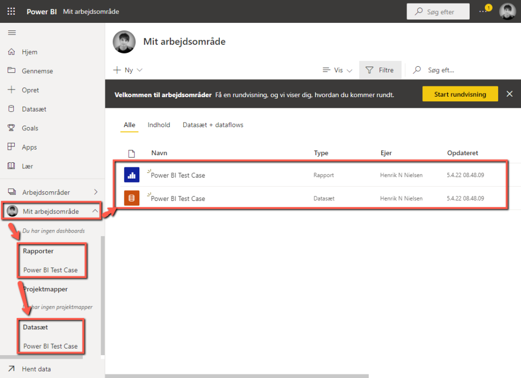
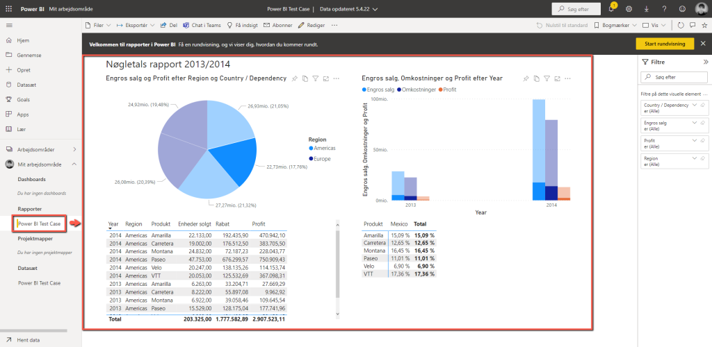
The report will then be available in the menu and can be shared with others. You can still click to filter data and miscellaneous items, but everything is locked in its location.
